Here’s a simple example of how to plot a linear regression using Python and Matplotlib:
   import numpy as np
   import matplotlib.pyplot as plt

   # Generate some random data
   x = np.array([1, 2, 3, 4, 5])
   y = np.array([2, 4, 5, 4, 5])

   # Calculate the slope and y-intercept of the regression line
   slope, intercept = np.polyfit(x, y, 1)

   # Calculate the predicted values of y using the regression line equation
   y_pred = slope * x + intercept

   # Plot the original data points and the regression line
   plt.scatter(x, y)
   plt.plot(x, y_pred, color='red')
   plt.show()
Let’s go through each line of code:
Import numpy as np – This line imports the NumPy library and renames it as np for convenience. NumPy provides useful functions for working with arrays and matrices in Python.
Import matplotlib.pyplot as plt – This line imports the Pyplot module from the Matplotlib library and renames it as plt. Pyplot provides a simple interface for creating plots and charts.
x = np.array([1, 2, 3, 4, 5]) – This line creates a NumPy array x containing the independent variable values.
y = np.array([2, 4, 5, 4, 5]) – This line creates a NumPy array y containing the dependent variable values.
Slope, intercept = np.polyfit(x, y, 1) – This line calculates the slope and y-intercept of the regression line using the polyfit() function from NumPy. The third argument 1 specifies that we want to fit a first-order (i.e. linear) polynomial.
y_pred = slope * x + intercept – This line calculates the predicted values of y using the equation of the regression line.
plt.scatter(x, y) – This line creates a scatter plot of the original data points.
plt.plot(x, y_pred, color=’red’) – This line adds a line plot of the regression line to the same plot as the scatter plot. The color=’red’ argument specifies that the line should be plotted in red.
plt.show() – This line displays the plot on the screen.
Let’s look a y_pred a bit closer. In the line of Matplotlib code plt.plot(x, y_pred, color='red'), y_pred is a NumPy array containing the predicted values of y based on the regression line equation that was calculated earlier in the code. The predicted values are calculated using the formula y_pred = slope * x + intercept, where slope is the slope of the regression line, x is the x-values of the original data points, and intercept is the y-intercept of the regression line.
The plt.plot() function in this code is used to plot the regression line on the same graph as the scatter plot of the original data points. The x and y_pred arrays are used as the x-axis and y-axis data, respectively, for the line plot.
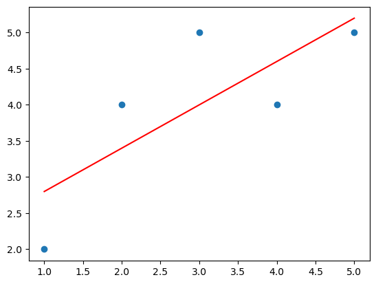
When you run this code, you should see a scatter plot of the original data points, with a red line overlaid that represents the linear regression line.
Image 1.0 – Linear Regression Model, With Best Fit Line (red)

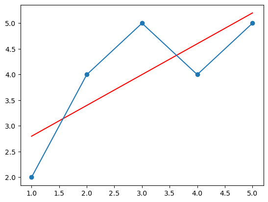
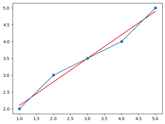
It can be difficult to determine the degree to which the data points are actually linear. However, a better picture of linearity (or lack thereof) of the graphed data points can be seen by connecting the data points with a line by adding plt.plot(x,y) as can be seen in figure 2.0. A much higher degree in fit to the linear regression line (red) would require, for example, data points 2 and 3 to be more in line with data points 1, 4, and 5, as in figure 3.0.
   import numpy as np
   import matplotlib.pyplot as plt

   # Generate some random data
   x = np.array([1, 2, 3, 4, 5])
   y = np.array([2, 4, 5, 4, 5])

   # Calculate the slope and y-intercept of the regression line
   slope, intercept = np.polyfit(x, y, 1)

   # Calculate the predicted values of y using the regression line equation
   y_pred = slope * x + intercept

   # Plot the original data points and the regression line
   plt.scatter(x, y)
   plt.plot(x, y_pred, color='red')

   # Connect the data points
   plt.plot(x, y)

   plt.show()
Image 2.0 – Linear Regression Model, With Data Points Connected (blue)

Image 3.0 – Linear Regression Model, With Higher Degree of Fit

To reiterate, the code imports the NumPy and Matplotlib libraries, then generates some random data points for x and y. Next, it calculates the slope and y-intercept of the linear regression line that best fits the data using the NumPy polyfit() function with a degree of 1 (meaning a linear function).
After that, it calculates the predicted values of y using the equation of the regression line. Then, it uses the plt.scatter() function to plot the original data points in a scatter plot and the plt.plot() function to plot the regression line on the same graph. The color parameter is set to ‘red’ to make the regression line stand out from the original data points. Finally, the plot is displayed using the plt.show() function.
So, the plt.plot(x,y) line in this code specifically plots the regression line on the scatter plot graph, where x is the x-axis data and y is the y-axis data, in this case, the predicted y values based on the regression line equation.